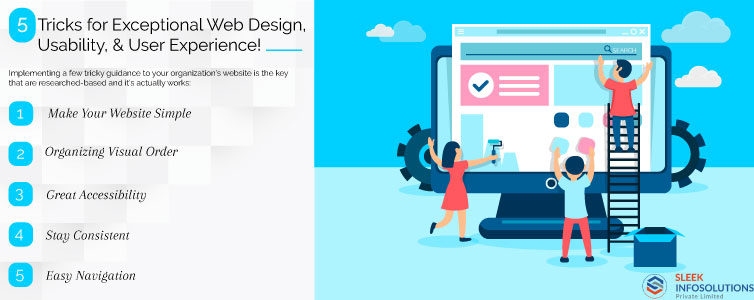
5 Tricks for Exceptional Web Design, Usability, & User Experience!
Never judge any website by its cover! When it meets expectations of designing or re-designing a website, it tends to be easy but difficult to get troubled on the aesthetics. “That shade of website background not good…. Wouldn’t it be better to have the logo on the correct side of the page? …. Is there a need to add an image amidst the page?”
However, for successful businesses, it’s necessary to accomplish something more with your website (e.g., lead generation, brand awareness, usability, etc.), you’ll need to focus on overall website design to fulfill your target I.e. amazing presentation and brand communication.
Implementing a few tricky guidance to your organization’s website is the key that is researched-based and it’s actually works:
- Make Your Website Simple:
When it comes to representing a website, most visitors see its original and meaningful content, high-quality images, design process and the way of evaluation. Adding irrelevant design elements like too many different colors, graphic designs, texts only to fill up the website page (i.e. elements that are added as showpiece having no functional purpose) can reduce your visitor’s interest and get the information what they’re trying to get.
So, make your website simple and make it informative for the similar seeking audiences.
- Organizing Visual Order:
The visual hierarchy can help you to arrange and organize your website pages’ elements in order to grab the visitor’s attention toward the most essential elements first. This method will let you serve simple and real navigation for the visitors to complete the action or purchasing or exploring the details they are looking for.
By fixing the segments like menu bars, text, images, color, and text size, will ease your user’s navigation or guide them towards their searching elements.
- Great Accessibility:
The latest technology has made accessibility worldwide and for all intents and intentions accessible whenever needed. Visitors are looking for any product, making purchases using various mobile apps, and starts researching in a hurry. A website design company should build such sites that would be good enough with any gadget and obtaining a site structure that is adaptable to stay aware with demand.
Content and pictures appear to be definitely unique on any mobile device than they look on a desktop. Guaranteeing your responsive website development task will acclimate with various platforms will upgrade visitor’s experience and assemble brand recognition.
- Stay Consistent:
If you always change the website design or themes frequently, then you may lose your audience attention. Make your website themes, colors, text and its fonts are consistent as it will serve a positive effect on usability as well as user experience.
Remember, your website each page should have the same exact layout. Alternatively, you can build various page layouts for certain kind of pages (e.g., one layout for landing pages, another for content/blog pages, etc.). It will let your visitors understand which page is showcasing what type of information as per their interest/requirement.
- Easy Navigation:
Having perspective website navigation is important to make sure visitors can find exact information what they’re seeking for.
Some tips for boosting your website’s navigation are:
- Keep the website structure for primary navigation simple.
- Add a navigation point on your website.
- You can use breadcrumbs on each page (other than the home page) so the visitor is attentive of their navigation trail.
- Avoid adding extra navigation choices on a single page.
- Add search box near to page menus, so that visitors hunt by keywords.
- Do internal linking within your page copy, and express where those links direct to.